

Сенсорные системы, 2022, T. 36, № 1, стр. 3-29
An overview of the visual acuity assessment. 2. Theoretical and clinical requirements to the optotypes and chart designs
G. I. Rozhkova 1, *, M. A. Gracheva 1, A. A. Kazakova 1, 2
1 Institute for Information Transmission Problems RAS
127051 Moscow, B. Karetny, 19/1, Russia
2 Pirogov Russian National Research Medical University, Ministry of Health of the Russian Federation
117997 Moscow, Ostrovityanova st., 1, Russia
* E-mail: gir@iitp.ru
Поступила в редакцию 17.07.2021
После доработки 6.08.2021
Принята к публикации 6.08.2021
- EDN: XUSFNW
- DOI: 10.31857/S0235009222010073
Аннотация
This paper presents analysis and discussion of the test images employed for the visual acuity (VA) assessment – the optotypes – and their distributions in the test charts. After brief description of the optotype early history and evolution, an attempt has been made to classify the existing optotypes and to analyze directions of their development. The following kinds of the optotypes are considered: letters, uniform configurations, periodic patterns, vanishing images, pictures, and embedded test stimuli. General theoretical and practical requirements to the optotypes are formulated. Specific advantages and disadvantages of certain popular optotypes are discussed in detail. The last section is devoted to the evolution of the charts for the VA assessment and their designs. A general conclusion is that there are no universal “golden standards” for the optotypes and the VA charts: their optimal structure depends on the purpose of investigation, characteristics of the contingent to be examined, and qualification of the examiners. In any case, the examiners have to understand advantages and disadvantages of the chosen tests and take them into account both in planning the procedure and interpretation of the results obtained.
INTRODUCTION
In the first paper of this series (Rozhkova et al., 2021), it was outlined that the complex structure of the human visual system makes it unrealistic to think of finding the best or universal test images for a general visual acuity (VA) assessment. Visual sensory system contains many parallel pathways with various autonomous modules designed for the analysis of specific visual stimuli – various combinations of input signals from our rich visual environment. The optical flows entering the eye in different conditions are very different depending on the parameters of the perceived visual scenes. In most cases, these scenes contain both stationary and moving objects of various sizes, shapes, and spatial positions. Evolutionally, the main principles of developing the animal visual systems were determined by the tasks of surviving: vision had to provide useful information necessary for navigation, feeding, and avoiding dangerous objects. Many of these tasks required fast analysis of the input signals to obtain a proper solution within a limited time interval that guaranteed successful behavioral response. It is evident that sufficiently fast sequential analysis of many heterogeneous data is impossible. Taking into account a great variability of the natural visual inputs, on the one hand, and essential limitations on the time of their processing, on the other hand, it seems justified that evolution resulted in developing parallel functional modules for simultaneous analysis of different inputs inside a global neuronal visual network.
Regarding the VA assessment, responses to certain visual test stimulus – called optotype – could only reflect the results of this stimulus analysis in the neuronal pathways relevant to processing such types of the stimuli and might be useless for predicting responses to the stimuli of other types. This means that, for comprehensive assessment of the VA, it is necessary to have a sufficient number of different optotypes and it is not clear how many different optotypes are sufficient. Both for theoretical investigation and for clinical work, it is important to minimize this number, however, the history of optometric practice demonstrates quite the opposite tendency. In this paper, we consider the reasons of this discrepancy and some directions of developing modern optotypes.
А proper choice of optotypes is one of the prerequisites to success of any investigation based on the VA measurements. The analysis of the literature available indicates that dozens of various optotypes are used by ophthalmologists and visual scientists. Moreover, in the cases of certain investigations there is a tendency to use more than one set of optotypes and to compare the results. Such investigations witness that the problem of choosing or creating the optimal optotypes for various scientific researches or clinical works has not yet been solved. It is evident that this problem needs renovation or revision in view of new findings and conceptions: at present, more rigorous criteria should be formulated for the assessment of the optotype quality and usability taking into account our enhanced knowledge, on the one hand, and the tendency to computerize measurements, on the other hand.
EARLY HISTORY OF THE OPTOTYPE INVENTION AND DEVELOPMENT
The necessity of having special test images that could be convenient for a gradual assessment of vision quality became evident since the middle of the 18th century in connection with spreading printed books and newspapers, and eye-glasses for optical correction of vision. To improve the choice of optical correction, it was natural to rely on quantitative assessment of the patient’s ability to recognize small objects either by means of increasing the viewing distance to the same objects (first type of the procedure) or by presenting the set of the objects of various sizes at the same distance (second type of the procedure). In particular, the optician could ask the patient to read one and the same fine printed text in conditions of varying distance or to view a set of printed letters (or other objects) of various sizes from the same distance in conditions of changing glasses. According to publications available now, the first procedure was used by an English optician James Auscough (1750) and a French spectacle master Jean Chevallier (1810) (see the reviews by Doria, 2020; 2021). The second procedure was more convenient for practice since it did not require moving the patient from one position to another. In 1835 Heinrich Küchler additionally eased implementation of this procedure by creating the appropriate chart that contained the images of big and small objects and animals pasted onto a sheet of paper in a regular order according to their size (see Wollman, 2020). Developing this idea further, in 1842 Küchler created 3 similar test charts with 12 lines of the German words printed in gothic style and placed them in an order of reducing their height from the top to the bottom of the chart. Thus, these charts provided a possibility to characterize vision quality by the numbers of the lines containing the letters seen clearly or just discernible. These test charts were published in 1843. However, some difficulties with reading the gothic style images of German words hindered spreading these charts. Later, Eduard Jäger used the same principle and created the charts with a larger amount of words in 3 languages – German, French and English – thus making such charts more widespread (Jäger, 1854).
To speak more precisely, reading of the printed text with different glasses was used not for quantitative assessment of VA per se (the notion of VA was not yet formulated) but for choosing the most proper optical correction. Nevertheless, such practice appeared to be also fruitful for developing the VA assessment methods. It had led to realization of the potential benefits from the quantitative characterization of visual abilities and put the task to elaborate proper standardized means and procedures for this purpose.
The key steps in this direction were made by Frans Cornelis Donders and by his co-worker (later becoming his successor) Herman Snellen in the 60-ies of the 19th century (Snellen, 1862; Colenbrander, 2008). Donders (1864) introduced the notion of visual acuity and the unit for its measurement. More practically oriented Snellen (1862) published the first test chart for the VA assessment containing standardized letters specially modified in view of graphic unification of the test images (they were drawn on the 5x5 grid; all the strokes were 1/5 of the letter height/width). Snellen suggested a general term optotype for any visual image designed for the VA assessment. At present, this term is mostly used in a special theoretical literature whereas, in descriptions of experimental and clinical investigations, many authors prefer to use its synonyms – test stimulus, object, symbol, target, sign, pattern, – probably, because these synonyms have more direct associations with the measuring procedures.
Noteworthy that, in some prototypes of his famous test chart, Snellen considered a possibility to use not only letters but also various simple abstract shapes: circles, squares, 2-bar and 3-bar configurations, etc. (see Figures from the University Museum in Utrecht reproduced in the paper of Colenbrander (2008)). Those shapes might be more appropriate for mathematical description and theoretical analysis. However, for practical reasons, Snellen eventually preferred letters11. Indeed, some practical reasons were evident. The Küchler’s and Jäger’s charts with printed words were already familiar to opticians, and observers had even less difficulties with response to the test letters than to words. Therefore, the Snellen’s chart with letters could be adopted as an understandable simplification and improvement of the previous charts. In contrast, the charts with the abstract shapes could require some additional time for familiarization and for obtaining consistent responses from the observers, thereby prolonging examination and making it more difficult.
It was not surprising that Snellen’s preference for letters exerted an impressive and fast positive influence on optometric practice but had long lasting negative influence on theoretical analysis of the optotype perception and improvement.
Luckily, at that period of time, the whole vision science reached significantly higher level of development. Hermann von Helmholtz and Emile Javal invented several very important ophthalmic instruments providing essential progress in investigations of the eye structure, understanding normal physiology of the eye, and performing more fine diagnostics of the eye pathology. Thanks to these instruments, the clinicians had got a possibility to assess impairment of refraction and accommodation of the eye as well as certain retinal anomalies. The appearance of such fundamental monographs as Donders’s On the Anomalies of Accommodation and Refraction of the Eye (published in 1864) served as an impulse for vision scientists to carry out more profound analysis of the eye functioning and to develop new approaches for an accurate assessment of basic visual functions and abilities.
In 1875 Ferdinand Monoyer (Monoyer, 1875) proposed a new chart and a new notation for the VA assessment. Though the chart did not become popular, the measure proposed is used until now. A novel notation of the VA was based on the minimum angle of resolution and was named decimal notation.
The next important achievement on the way to the standardized quantitative assessment of the VA was the invention of a special non-letter optotype by Edmund Landolt (1888). It has an annular shape with one small gap in the contour (“broken ring”). Later, such image was named Landolt C. In the modern test sets, there are usually 4 or 8 Landolt Cs with 4 or 8 different positions of the gap, respectively. From theoretical point of view, the remarkable property and the main attractive feature of such sets is a general uniformity of the optotypes in the set: these optotypes can only be distinguished on the basis of a single parameter – the gap position.
In 1889 there was published a chart with one more set of the optotypes having such a property – the set of short-stroke E-letters in four orientations. These optotypes are similar to the so called tumbling E optotypes (Taylor, 1978) considered as of non-letter type. Though configurations of all the optotypes in the set correspond to the letter E, three of them have the orientations not inherent to the Latin letters. Like in the case of the Landolt Cs, in the case of the set with four E-shaped optotypes of different orientations (with the three parallel lines directed up, down, to the left, and to the right), recognition of the presented test optotype is also based on one parameter – the orientation. However, this property of tumbling E was not appreciated at the time of its invention, it was only outlined that such optotypes could be good for examination of the illiterate individuals since the required response implied indication of the image orientation but not telling the letters.
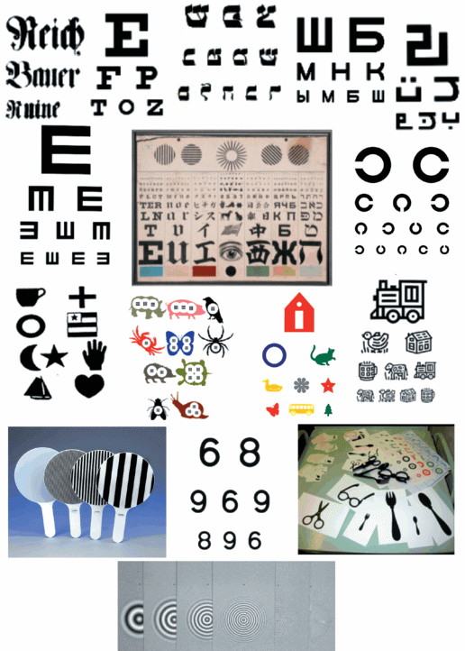
During the interval of about 50 years after the Landolt C invention, there were no principal innovations in creation of the optotypes but, later, several branches of parallel development appeared to be growing rather rapidly and led to a fast increase in the amount of the optotypes and the methods of their presentation available in modern practice. As an illustration, some examples of such products are shown in Figure 1. Because of their multiplicity and variability, it is not rational to describe here when, why and by whom each specific optotype was introduced. It seems more useful to give a general description of developmental branches and classification of the optotypes used at present.
VARIETY OF OPTOTYPES AND THEIR CLASSIFICATION
This section presents the results of our attempt to determine the main directions of the optotype evolution (improvement) and to classify them on the basis of their critical properties. The appearance of the new test images over the time and the configurations of the optotypes used nowadays are presented schematically in Figure 2. It includes both the widespread traditional optotypes and some more specific optotypes proposed recently. Each configuration has also various other modifications not shown in this figure.
Retrospectively, in evolution of the optotypes, it is reasonable to separate six branches:
(1) Letter optotypes: Snellen letters (1862) – Green letters (1868) – Sloan letters (1959) – Filtered letter images – Vanishing letters on gray background;
(2) Uniform optotypes – the identical shapes in variable orientation: Landolt C (1888) – Tumbling E – 3-bar targets;
(3) Periodical patterns: Black-white gratings with sharp bars – (Teller preferential looking test charts) – Checkerboard patterns – Sinusoidal gratings – Gabor patches – Modified 3-bar targets;
(4) Vanishing optotypes: Cardiff test – Koskin Cs – Auckland optotypes – Moorfields letters (2016);
(5) Pictorial images: Allen Preschool test (1957) – Orlova’s chart – Rossano images (purely pictorial images, contour and silhouette images, images composed of grating patches, etc.);
(6) Embedded images: the test stimuli included as the insets into a larger figures (like Landolt C in “Broken wheels”) or drawn over a surrounding image serving as a background.
This categorization is based on the characteristic features of the optotype shape, on the one side, and on the observer’s responses implied by the instruction, on the other side. It is not always easy to determine belonging of an optotype to certain category and sometimes the solution is ambiguous since certain optotypes have such properties that they could be considered as the features of some two or even three categories. For instance, 3-bar targets included into the category of the uniform optotypes can also be considered as periodic patterns; Cardiff test images can be treated both as vanishing and pictorial optotypes; etc. There are also some other varieties of the optotypes that have no direct relation to any of the described categories. It is impossible to analyze the whole variety of optotypes in detail and it is not the purpose of this paper. After a brief comment on each branch of the optotypes, we’ll consider some general problems of their usage and development.
– Letter optotypes. As a rule, these optotypes have rather complex shapes. In general, each letter contains several components of different size and curvature. The observer’s task is usually one and the same: to recognize the presented letter. As was mentioned above, the first letter-like test images specially designed for quantitative assessment of the VA were Snellen letters. Though these images looked like ordinary letters used by opticians earlier in the charts with printed words, one could notice two principal achievements. (1) Configurations of Snellen letters were standardized: all of them were drawn on 5 × 5 grid and had one and the same stroke width of 1 grid element. Since Snellen had the idea that letters should contain maximum possible number of details of one-element size, he preferred capital letters with serifs of “Egyptian Paragon” text style. (2) The sizes of Snellen letters were scaled in relation to the optotype with the one-minute angular size of the stroke width. The original set of these letters met the one-minute criterion at the distances 20, 30, 40, 50, 70, 100, and 200 feet.
Somewhat later, John Green proposed radical changes in the style of the letter optotypes and the gradations of size. Thinking of equal legibility of the test letters, he wrote: “…in selection of letters for tests of vision, it is important to choose those which are most nearly uniform in size and character…” (Green, 1868, p. 69). Proceeding from this idea, Green used the letters of less complex, sans-serif style and discarded 12 letters of the alphabet, which could not be drawn on 5 × 5 grid, as well as certainly peculiar letters I, J and Q.
The next important step in use of the letter optotypes for the more accurate VA assessment was made by W.S. Dennett who had found that the threshold distances for recognizing different sans-serif letters of equal height were essentially different: e.g., for the letter height of 2.5 cm, these distances were varying between 10.3 and 17.7 meters (Dennett, 1886; Linksz, 1972). In his report, Arthur Linksz wrote:
“…Such discrepancies obviously proved that the height of the letters in itself, even if expressed in terms of visual angle, is a poor measure of visual acuity. Dennett found that among the letters investigated there were eight – P, Z, K, R, N, G, C, and F – the legibility of which averaged between 13.0 and 13.7 meters.
Applying these findings, Dennett constructed a new chart in which the individual lines did not contain letters of equal height. His five-meter line consists of letters readable at five meters, not of letters having a certain angular dimension at five meters.” (Linksz, 1972, p. 321).
The other letter set, the Sloan’s test letters are widely used in clinical practice nowadays, for example, in ETDRS chart, in Freiburg test, in Moorfields acuity chart, etc. The set consists of 10 letters (Z, N, H, R, V, K, D, C, O, S) designed similarly to Green’s letters and chosen on the basis of nearly equal legibility (on author’s opinion based on the VA measurements in 234 eyes) (Sloan, 1959).
In regard to a general appreciation of the letters as the optotypes, it’s reasonable to cite more than a century-old opinion of a famous ophthalmologist who had performed a well-known classic investigation of peripheral vision:
“…letter symbols, although indispensable in ophthalmic practice, are the least suitable for accurate experiments. The different degrees of recognizability of various letters, and the possibility of guessing the whole from recognizing some of its parts, are known disadvantages of such testing material.” (Wertheim, 1894, Translation of I. L. Dunsky: Wertheim, 1980, p. 916).
Nevertheless, up to date, many ophthalmologists believe that the test charts with letters can be used as “a golden standard” for precise VA measurement. Probably, at least one more century is needed for rethinking and changing this opinion.
– Uniform optotypes. The idea of using the optotypes having identical shapes but different orientation belongs to Landolt (1888). A famous Landolt’s test images, now known as Landolt C optotypes, look like broken rings identical in all respects except a small break (gap) at different positions of the ring. The observer’s task is to indicate the position of the gap in the presented test image. In 1909, XI International Ophthalmological Congress adopted Landolt ring as the standard test object. At present, Landolt C is still recommended as the standard optotype despite its disadvantages revealed during the last decades. These disadvantages are of the two different kinds: firstly, it is not easy to interpret the results of the VA assessment based on Landolt Cs in terms of the critical parameters of the test image (Bondarko, Danilova, 1997); secondly, there are evident limitations in presenting small images of circular shape on displays having square pixels: there appear distortions that reduce the accuracy of the VA measurements with Landolt Cs by means of computer technique.
Other uniform optotypes introduced later – tumbling E (or illiterate E) and 3-bar targets – share their main advantages with Landolt C. Certain disadvantages of such uniform optotypes were not clearly understood until the analysis of their two-dimensional Fourier spectra was performed (Anderson, Thibos, 1999a, b; Rozhkova et al., 2012, 2017). In particular, such analysis has revealed that these uniform optotypes can be recognized on the basis of the spatial-frequency components of their Fourier spectra that are much lower than the characteristic frequency Fc. corresponding to the smallest elements of the test image and presumably determining the true VA. This does not mean that it is impossible to create uniform optoptypes of better quality, for instance, by means of modifying configurations of certain “imperfect” uniform optotypes in the test set to exclude the possibility of their distinguishing on the basis of the rough image features but not of their fine structure.
The investigations aimed at assessment of the contribution of the low-frequency Fourier components to the optotype recognition and the attempts to improve the uniform optotypes are considered below in a separate section.
– Periodical patterns. It is noteworthy that the patterns of this type were proposed for a quantitative VA measurement even earlier than Snellen letters (Jaeger, 1854). Test images, presented by E. Jaeger in his book, were regular groups of black bars separated by white interspaces of identical width. The task was to determine the maximum distance at which the white interspaces in a given test group of bars could be seen and counted. This method is closely corresponds to contemporary methods based on resolution of spatial gratings with sharp contours of bars.
Unfortunately, Jaeger’s invention remained practically unnoticed, evidently not only because of its improper publishing as an appendix to the book devoted primarily to cataract and its surgery, but also because vision specialists were not ready to accept such test images at that time. At present, the advantages of gratings for accurate VA measuring, are clear to all the scientists carrying out theoretical investigations of visual processing and to all ophthalmologists using objective methods of the VA measurements (such as interference method of measuring retinal VA bypassing eye optics; method of visual evoked potentials, etc.). However, it is not so easy to apply periodic patterns in the framework of traditional VA measuring methods implying presentation of charts. Luckily, there are remarkable alternative solutions – such as Teller’s and Vital-Durand’s charts for infants or computer-aided methods based on finding the highest perceived spatial frequency in the course of contrast sensitivity assessment as a function of spatial frequency (Westheimer, 1972).
– Vanishing optotypes. The term vanishing optotype was suggested for the VA test targets with a peculiar property of equal detection and resolution thresholds (Frisén, 1986). In the experiments of Frisen, test letters of varying contrast generated on a television monitor were studied with regard to detection and resolution thresholds, both for the native configurations and after high-pass spatial frequency filtering. Such filtering reduced the interval between detection and resolution thresholds and could result in disappearance (vanishing) of the test target at the stimulus level when it became unrecognizable.
In later works, instead of the true high-pass filtering, some pseudo high-pass filtered images and certain test images with complex structure of the contours were mostly employed to provide the desired property of the image vanishing at recognition threshold. A pseudo high-pass design is characteristic of the letter VA charts. Such charts came into use soon after the time of the vanishing optotype appearance and were applied later in many investigations (Koskin et al., 2007; Koskin, 2009; Shah et al., 1996; 2010, 2011, 2016; Anderson, 2017; Wen et al., 2021; Moiseenko et al., 2020; etc.)
Comlpex contours are mainly used in the VA tests for children and illiterate adults. One of the examples is a widespread Cardiff Acuity Test for 1-3-years-old children (Fariza et al., 1990). It includes the images of 6 objects on gray background with triple contours consisting of the central white line and two twice thinner black lines on both sides of it. The parameter varying to find the threshold is the line width but not the test object size. Examination procedure is based on the preferential looking method (Teller, 1979): the child usually keeps her\his gaze at the half of the sheet where he/she sees the test object (the other half is a homogeneous gray field).
Vanishing optotypes appeared to be good not only for testing children but also for detailed medical examination of the patients inclined to simulate incorrect results (Koskin, 2009) and for improving differential ophthalmic diagnostics in clinic (Anderson, 2017). In scientific investigations, vanishing optotypes are mainly presented by Gabor patches – the fragments of sine-wave gratings with Gaussian envelope. When, with decreasing size, the Gabor patch structure became indiscernible, the patch could vanish (became invisible) if its average lightness/brightness was equalized with lightness/brightness of the grey background. Unfortunately, the effect of vanishing is rather sensitive to the parameters of test images and background; this shortage restrains spreading of vanishing optotypes. Nevertheless, the interest to the charts with vanishing optotypes is growing, especially in clinical investigations (Shah et al., 2016; Anderson et al., 2017; Hamm et al., 2018a, b; Moiseenko et al., 2020).
As an alternative to the optotypes that are vanishing completely, one could consider the optotypes with vanishing structure: they became not invisible but unrecognizable when their fine components became undistinguishable with decreasing size. In other words, the sets of such optotypes consist of certain black-white patterns on white background that can transform into uniform grey spots or more complex vague configurations having one and the same shape. The examples of such optotypes are the modified 3-bar targets (perceiving at threshold as identical blurred square spots) proposed in 2012 (Lebedev et al., 2012; Rozhkova et al., 2012; Lebedev, 2015) and the special variety of the Auckland optotypes perceiving at threshold as indistinguishable blurred rings (Hamm et al. 2018 a, b; 2019).
– Pictorial images. Schematic drawings of simple objects (either of silhouette or contour type) were introduced into optometric practice for VA assessment in children and illiterate adults in parallel with creating the VA charts containing abstract configurations. As was mentioned above, according to recent historical evidence (Wollman, 2020), Heinrich Küchler had used pictorial images as early as in 1835 in his first chart (not published) that served as a prototype for his later charts with German words printed in gothic letters, and for many other charts. At present, the most common are Orlova’s silhouette objects (for the first time, the chart was published in Russia in 1926); Allen pictures (Allen, 1957; published in the USA in 1957 for the first time); Kay pictures (Kay, 1983; published in England in 1983); Lea symbols (Hyvärinen, 1980); Broken wheel test of Richman (1984); BAST test.
The process of upgrading pictorial images was aimed at making them closer to the standard images and more convenient for an accurate assessment of VA. For instance, it was true of the test images elaborated by Lea Huvarinen who tried to create a standardized pictorial test set (Huvarinen, 1980) providing good reproducibility of results. The four Lea symbols named “ball”, “apple”, “square” and “house” are actually simple contour configurations. They are made symmetrical to avoid left-right errors in responses, and are drawn with the thinner lines (in comparison to most standard optotypes) to make their threshold blurred images more difficult to distinguish. Although the proportion between the line width and the whole optotype width is not 1:5 as in the recommended standard, Lea symbols proved to be well suited for quantitative VA assessment in children. Because of the thinner lines, Lea symbols were made larger than other comparable standard optotypes for the same VA level.
– Embedded images. Since small abstract optotypes are often not interesting for children, some researchers embedded these test images inside significantly larger and more attractive figures in order to direct attention of the examined child to the needed optotype. The most widely known example of such an approach is the Broken wheel test in which the optotypes – the Landolt Cs – are incorporated into the images of the cars instead of their wheels. A series of charts with embedded the 3-bar stimuli was created in 2014 (Rozhkova et al., 2014).
In conclusion of this section, it is useful to repeat that the categorization presented here is far from being perfect: many optotypes have “mixed” properties characteristic of two-three cathegories. However, in most cases, the main feature determining the choice of category is salient. It is noteworthy that, in all branches of the optotype evolution, one could notice a tendency to modify the initial test images in a way allowing use them as vanishing optotypes.
GENERAL PRINCIPLES OF THE OPTOTYPE FUNCTIONAL QUALITY ASSESSMENT
There are many fine papers describing history of developing new optotypes and introducing them in practice of VA assessment (Linksz, 1972; Colenbrander, 1988, 2008; Kniestedt, Stamper, 2003; Doria, 2020; 2021; and oth.). However, one could find not so many studies devoted to a general analysis that could provide a basis for comparative estimation of different optotypes as concerned their functional essence, potential possibilities, advantages, and disadvantages of their use – the characteristics that could be united by the term “functional quality”. A fundamental advancement in this direction of research became only significant after application of the information theory, spatial frequency conception and Fourier transformation to the analysis of processing retinal images in the human visual system (Campbell, Green 1965; Campbell, Robson 1968; Anderson et al., 1996; Anderson, Thibos 1999 a, b; Watson, Ahumada, 2008; 2012; Rozhkova et al. 2012, 2017; Lebedev, 2015).
Most publications on the quality of optotypes present the data of comparative experimental studies with employment of two different optotypes. The results are usually interpreted in terms of “underestimation” or “overestimation” of some hypothetical true VA value (Held et al., 1979; Gräf, Becker, 2008; Stiers et al., 2003, 2004; etc.). However, it needs to be emphasized that the VA values obtained by means of different optotypes correspond to different visual capabilities and, therefore, to different true values. As has been outlined in the previous sections, each kind of optotypes measures certain specific capability and, therefore, it is senseless to speak of under- or overestimation without reference to the capability that actually was investigated. In this respect, it seems necessary to perform theoretical analysis of different optotype processing in visual pathways and to elaborate reasonable approach to the optotype choice in different cases.
In scientific literature on the VA measurements, there are many discussions on the issue what visual capabilities are actually estimated by means of different optotypes and vice versa – what optotypes should be used for assessment of certain visual capabilities. However, up to date, in theoretical investigations, but only some partial aspects of the problems concerning this approach have been analyzed successfully since a thorough estimation of the optotype advantages and disadvantages needs taking into account a large number of heterogeneous factors.
The rational way of optimizing the optotypes is to start from clear formulation of the purposes and the tasks of specific measurements, on one hand, and the visual capabilities actually provided by the neuronal modules and pathways involved in processing different optotypes, on the other hand. This is not a new idea though it is often expressed unclearly and somewhat differently in different papers.
The main purposes of the VA assessment are: (1) visual screening; (2) monitoring of vision in view of age dynamics, development of pathology, assessment of treatment and training effects; (3) standard medical examination; (4) medical examination for professions requiring fine vision; (5) juridical medical examination.
– Visual screening, i.e. relatively fast and standardized VA assessment aimed at examination of a large number of people (usually carried out at schools) to reveal the cases of evident visual impairment by comparison of individual VA values with certain population normative values obtained as a result of regular population surveys. On the basis of this comparison, the conclusions are made about the necessity of the more profound investigation, correction and treatment for each examined individual. Screening does not imply precise measurement of the individual’s VA if its value exceeds the normative level.
– Visual monitoring, i.e. regular VA assessment with high accuracy. Population VA monitoring is necessary for optimizing a general vision care system. Regional monitoring data may provide information on the effect of various social, technological and ecological factors. Individual VA monitoring is aimed at controlling visual development, providing early diagnostics, estimating the efficiency of treatment.
– Standard medical examination implies an accurate assessment of VA by means of special methods in view of differential diagnostics in the cases of rare diseases or the necessity to exclude simulation in the cases when “inhonest” participants try to demonstrate reliable results corresponding to the lower or higher VA in order to gain certain benefits.
– Medical examination for professions requiring fine vision, i.e. assessment of VA by means of methods corresponding to certain professional activity in order to decide if the participant examined fits certain professional criterion.
– Juridical medical examination is aimed, as a rule, at assessment of low and very low vision levels up to blindness in order to determine the type and amount of social support needed to the patient. In the cases of very low vision, use of common methods of VA measuring is impossible and special methods of the patient examination are required.
Among the visual tasks (and corresponding abilities) directly indicated in connection with VA measurements are such as detection, resolution, discrimination, identification, recognition (Shamshinova, Volkov, 1999; Heinrich, Bach, 2013). Each of these abilities could be assessed using different experimental paradigms (optotypes, methods of their presentation, algorithm of their size varying and decision making procedure), various illumination levels (photopic, mesopic, scotopic) and different viewing conditions (monocular or binocular presentation, central or peripheral visual field, different stimulus duration, etc.) thus activating different neuronal pathways. As a result, the number of visual capabilities that could actually be assessed in the procedures named as “VA assessment” is rather large and each estimate needs specifying attributes, e.g., peripheral VA, mesopic VA, monocular VA.
It is evident that each purpose/task imposes certain specific demands on the methods and conditions of VA measurement, and in particular, on the optotype structure. However, there are also common general requirements that seem reasonable or, at least, desirable of any set of optotypes irrespective of their specific application and structure. The preliminary list of such requirements was included into one of our previous papers (Rozhkova et al., 2017). Here, we present somewhat upgraded version of this list with brief argumentation.
GENERAL THEORETICAL REQUIREMENTS TO THE OPTOTYPES
The list of the requirements to the set of optotypes that seem to be obvious and/or have been mentioned in the literature on the VA measurement consists of the following points.
1. Similarity of average lightness/brightness. It’s important to exclude a possibility to use average lightness/brightness of each optotype for distinguishing optotypes in the set since it has no relation to the VA but could provide high probability of right responses in the case of the optotypes occupying significantly differing parts of the test image field (like the letters B and T (Y) in the ETDRS charts or the pictures of scissors and horses in the test images of Rossano.
2. Structural uniformity. In all optotypes of a given set, their components (elementary parts) should be similar. All the stimuli in the set should excite similar functional modules (neuronal detectors, filters) at the periphery of the visual system. Otherwise, different optotypes could activate principally different neuronal pathways, and, therefore, the responses to different optotypes would characterize different visual abilities.
3. Gnosiological equivalence. This requirement implies involvement of the same higher visual centers (or obviation the need of them at all) in discrimination of all the symbols in the set. It is evident that one and the same set of the optotypes should not include such different test images as gratings, letters and schematic pictures of objects that could have different degrees of familiarity and significance for different participants.
4. Equality of information content. Ideally, probability of identification should be equal for all the optotypes in a given test set. In particular, this implies that the optotypes should contain equal amount of information to exclude a priori inequality in the ease of each optotype processing.
5. Identical values of Fc in different optotypes designed for the same VA level (e.g. for the same line in the charts). The characteristic spatial frequency, Fc, is the frequency in the Fourier spectrum of the optotype that supposed to determine its visibility or recognizability at threshold. It is evident that Fc should be identical in all optotypes of the set corresponding to one and the same VA level since all of them should have equal visibility. This natural requirement could be considered as an appendix to the requirement 2.
6. Strong linkage between the optotype legibility and Fc . Presence of well expressed spectral peaks corresponding to Fc is a necessary condition for dependence of the optotype visibility on Fc. Actually, this requirement has to be addressed to the neuronal optotype images at the input of the processing modules in the brain since the physical (light) images of optotypes projected onto the retina are filtered at the further stages of image processing. However, it is reasonable to think, that the peaks corresponding to Fc should not appear in the neuronal image of the optotype if they are absent in the physical image.
7. Similarity of low-frequency patterns of the two-dimensional Fourier spectra of all the optotypes in the test set providing insignificant influence of the low-frequency components on distinguishing the optotypes. This requirement means that inter-optotype differences in the low-frequency part of the Fourier spectra should be minimized in order to guarantee that recognition of the optotype presented would be based on the high-frequency part of its Fourier spectrum around Fc.
8. Equal legibility of optotypes, i.e. equal probabilities of correct responses to all optotypes of one and the same size in the set. Actually, this requirement is an addition to the requirements 2 (structural uniformity) and 7 (identical values of Fc). It outlines that probability of the optotype identification should not be biased by the features not relevant to the VA measurement. As was reminded by A. Linksz (1972) in his historical review of J. Green’s contribution to ophthalmology, the importance of this criterion was claimed by W.S. Dennett as early as in 1885 at the meeting of AOS (Dennett, 1886): he found that different letters of 2.5 cm high could be recognized at distances varying between 10.3 and 17.7 meters (!) and selected 8 letters of similar legibility. Dennet constructed a new VA chart with the lines containing letters of unequal height, e.g. his 5m-line consisted of the letters equally readable at 5 m, not of letters having certain angular size at 5 m. However, A. Linksz outlined that Green had mentioned unequal legibility of the Snellen type letters in the chart lines even much earlier, in his first communications to AOS.
Ideally, point 8 also means that the proportions of correct and erroneous responses for the optotypes of equal sizes should be equal to each other, and that the probabilities of erroneous identification of a given optotype as certain other optotype from the same set should also be equal for all the pairs.
9. Steep psychometric function. For an accurate assessment of the threshold value of the optotype size, the probability of correct responses should rise rather rapidly with increase of the size. Otherwise, due to inevitable noise, the variability of responses would correspond to a wide range of sizes and it would be difficult to determine the threshold size corresponding to the criterion accepted with sufficiently high accuracy.
10. Easiness of computer generation and varying the size of the optotypes. This requirement is included in view of a tendency to computerize the VA assessment. Computerization allows to make the procedures of the VA assessment similar to games, to use adaptive algorithms, to create a wide variety of complex optotypes. However, one should take into account certain restrictions of discrete displays hindering reproduction of curvilinear and diagonal contours and limiting reproduction of smooth gradients in the cases of the smallest optotypes determining the upper level of the measurable VA values.
It is easy to understand that to fit all these requirements is practically impossible. At the same time, in some cases, the optotypes appear to be quite good for certain purposes despite low level of fitting most of these requirements. It seems likely that, in such cases, a discrepancy could be explained by a strong influence of some other factors not taken into account in the list proposed. To illustrate this, let us consider the estimates based on this list of requirements for the following four sets of the widespread optoptypes: Landolt C, tumbling E, Lea symbols, and HOTV test for children (Table 1).
Table 1.
Characteristics of the four widespread sets of optotypes in view of the proposed list of requirements. The signs “+” and “–” mean YES and NO in correspondence to fitting or not fitting of the requirements indicated. The line 9 is not filled since it needed experimental data but we could not find sufficient information for all the test sets compared
| № | Requirement | Optotypes | |||
|---|---|---|---|---|---|
Landolt C
 |
Tumbling E  |
Lea symbols  |
H O T V | ||
| 1 | Similarity of average lightness | + | + | – | – |
| 2 | Structural uniformity | + | + | – | – |
| 3 | Gnosiological equivalence | + | + | – | + |
| 4 | Equality of information content | + | + | – | + |
| 5 | Equality of characteristic frequencies | + | + | + | + |
| 6 | Direct relation of legibility to characteristic frequency | – | – | + | – |
| 7 | Similarity of low-frequency contents | – | – | + | – |
| 8 | Equal legibility | + | + | + | + |
| 9 | Steep psychometric function | ||||
| 10 | Easiness of computer generation | – | + | – | – |
| Σ | 6 | 7 | 4 | 4 | |
These sets of optotypes were chosen for our analysis because they contain equal number of elements – four optotypes in each set. The Table 1 shows that, Landolt C and tumbling E have the largest numbers of pluses. These optotypes fit most theoretical and practical requirements better than many other optotypes. It is evident that the set of Landolt C is ideal as concerned structural and semantic uniformity and not good for presentation on the monitor screens with discrete structure because of distortion of the curvilinear contours. Moreover, it has been shown that Fourier spectrum of Landolt C contains well expressed low frequency components that contributes to recognizing image orientation and, on average, causes “overestimation” of VA if it is anticipated to correspond to the size of the smallest parameters (the gap width and the width of the ring) (Bondarko, Danilova, 1997). Tumbling E shares all advantages and disadvantages of Landolt C but, unlike Landolt C, tumbling E is ideal for presentation on most displays. However, its use for estimation of the VA as the resolving power is also problematic because the presence of low frequency components essentially influences legibility of the optotypes at threshold and, in addition, that influence is not similar in different observers (Rozhkova et al., 2012; 2017).
Lea symbols are not uniform and not equivalent semantically and not well suited for computer presentation. However, their specific configurations and proportions provide fitness to the most important requirements – equal legibility and small contribution of low-frequency spectral components to the optotype recognition. Identity of Fc values in all four symbols is also evident since, in this set, Fc is determined by line width that is one and the same in different symbols of each VA level. These pluses appeared to be more essential than minuses in uniformity and semantics. The explanation could be that the very schematic drawings of Lea symbols evoke but faint associations with real objects and might be treated simply as geometric configurations.
HOTV is a test commonly used for preschool children. It is assumed that these four letters (that could be considered not as letters but as different geometric configurations) are of similar legibility and it seems likely. However, they are not uniform in structure (“V” is composed of oblique lines; “H” and “T” contain different numbers of vertical lines; “O” is curvilinear, unlike all the three other elements) and low-frequency spatial spectral components seem to play a significant role in their recognition (their blurred images can be recognized at high degrees of blur when high-frequency components are almost absent). Nevertheless, the HOTV-set is very popular and, evidently, useful test.
The HOTV test was proposed for very young or mentally retarded children in 1930 and was modified later by the same authors (Pugmire, Sheridan, 1930; 1957). At present it is considered as appropriate for children of developmental ages between three and seven years. Its popularity could be explained by the fact that, choosing these optotypes, the authors had taken into account the age norms for perception and copying geometric figures (see Lippmann, 1969; 1971). One of the benefits of these optotypes is their symmetry in relation to the vertical axis, so no confusion between right and left side influences the assessment. It is obvious that a good match of the test material to the age norms is one of the important conditions providing success in practical work.
Practical requirements to the optotypes
Most researchers having experience in employing various tests for the VA assessment know that the applicability and popularity of a given test depends not only on its theoretic perfection but also on many heterogeneous factors essential for its attractiveness to patients and providing efficiency of work for scientists and clinicians. Below we present a preliminary list of practical requirements. It begins from the requirement considered just above and contains some brief comments.
– Correspondence of the test content to the observer’s age. This means that the test content has to be in concordance with the relevant ontogenetic data concerning visual system. It is well known that even newborns have certain inborn preferences in looking and that, for infants and younger children even simple geometric figures differ in salience, legibility and attractiveness. For instance, newborn prefer to look at a schematic face when it presented in pair with a random configuration of the same pictorial elements (Fantz et al.,1962); preschool children could copy the lines of different orientation and simple geometrical figures sufficiently well at various ages (Sheridan, 1960), etc. Inborn preference to look at a structured visual field when it is paired with a homogeneous one has been used by Davida Teller to elaborate her remarkable method of preferential looking (Teller, 1979) which appeared to be proper for practical use in clinical and scientific investigations of infant vision. In adults, the paradigm of preferential looking is not employed because of natural changes with age in visual and other abilities of the testees permitting to employ a large variety of more effective paradigms for the VA assessment. As concerns a routine VA assessment, young adults could be tested with equal success using letters and simple optotypes whereas old people with low vision (e.g. cataract patients) show essentially better VA with simpler optotypes and lesser number of optotypes for choice in the test set (Kazakova et al., 2020).
– Simplicity of the visual task. During testing, most people feel certain discomfort because they undertake some efforts to adapt to the unfamiliar circumstances and experience some anxiety about the results of examination. Therefore, at any age, the simpler the visual task given to the testees, the better for them and for the examiners regarding psychological comfort, easiness of communication and duration of the VA assessment procedure.
– Familiarity and attractiveness of the optotypes. Familiar optotypes or the ones with interesting features stimulate friendly interaction between the testee and the examiner, and motivate testees, especially children. From this point of view, for an accurate VA assessment in younger children, it seems beneficial to use embedded optotypes since the dull uniformity of the test images can be compensated by a vast variety of interesting surroundings.
– Easiness of identification and consistency of naming (description) of the test stimuli. In certain cases, the testee has difficulties with proper naming of the presented test image which is well seen but permits ambiguous descriptions (e.g. abstract configuration or unusual complex shape of a well known object). That is why the optometrists like letters so much: there is no need to explain how to respond to the presented optotypes. In contrast, because of difficulties in verbalization, even in the cases of very simple abstract figures, testing is often impossible without employment of the samples placed near the testee to select the presented test figure from the whole set and to indicate it manually. Naturally, moving the gaze from the test chart to the samples and back takes time and makes the examination more tiresome and long.
– Laconic, clear, and unambiguous instruction. It is advantageous if the instruction can be formulated in two-three sentences, easily understandable for the examined individuals, and unambiguous, i.e. does not permit more than one interpretation. The characteristic example of such case is the 3-bar optotypes. This test is graphically simple and theoretically good. Moreover, its structure copies traditional physical test for assessment of the optical system quality (USAF-1951). However, unexpectedly, it appeared that a significant percentage of individuals perceive this test as ambiguous and demonstrate incorrect responses. For this reason the test can only be used with precautions and additional explanations. The psycho-physiological basis of this situation is considered in more detail in the next section.
– Taking into account age-dependent psychological peculiarities of the response behavior. Younger children and old adults with impaired vision sometimes refuse to respond to the test image presentation seemingly without any reason. However, some reasons of such a behavior can usually be discovered in the course of a friendly interviewing the testees after or during examination. In some cases the reason reminds of the situation with the Buridan’s donkey (dyed of hanger being unable to choose between two equally attractive sources of food). Evidently, it concerns extremely indecisive persons unable to make a decision at near threshold conditions (when certain test images appeared to look as almost identical). In other cases the testee are incapable to name very simplified silhouette images of the test objects or suspect that his/her response will be laughed at. Most refusals are of psychological origin. However, there are also more rare reasons of silence. For instance, some children keep silence when they do not agree to pronounce the name of a certain schematic image since this image does not contain the details which they consider to be absolutely necessary for a real object.
The above consideration of various theoretical and practical requirements to the optotypes shows that the researchers are still at the first stages of a long way to reliable and adequate appreciation of each optotype functional quality and usability.
SPECIFIC ADVANTAGES AND DISADVANTAGES OF CERTAIN OPTOTYPES: EXAMPLES OF A MORE DETAILED ANALYSIS
It is often difficult to comprehend some important properties of the optotypes from the first glance, and, in particular, to notice principal difference between apparently very similar optotypes. In fact, only after a thorough theoretical analysis and a special series of comparative experiments one could appreciate adequately all the aspects of using a given optotype. In literature, descriptions of such investigations are not numerous for two reasons: the clinicians and practical users rely on traditions and authorities unconditionally (1); the researchers-theoreticians usually examine not enough number of observers and describe their results in a form far from practical needs.
Here, we present the examples of investigations devoted to a more detailed analysis and/or experimental assessment of the following optotypes: sinusoidal gratings, 3-bar targets, tumbling E and letters. Our purpose is to demonstrate some principal benefits and difficulties encountered in experimental and clinical work with such optotypes and to emphasize the necessity of being more precautious in interpretation of the results obtained with a given optotype and in performing comparative studies with different optotypes.
Sinusoidal and sguare-wave gratings
Gratings were chosen for thorough analysis in this review as the optotypes appropriate for assessment of a very important kind of the VA – the resolution VA, or the resolving power of the visual system. In physics, sinusoidal and square-wave gratings traditionally serve as the tests for measuring visual resolution of various optical systems. The specialists in vision science widely employ sinusoidal gratings since the second half of the last century, thanks to the pioneering works of Campbell and his coauthors introducing Fourier analysis in vision studies (Campbell, Green, 1965; Campbell, Robson, 1968). In parallel, the advantages of sinusoidal gratings for optometry were also appreciated and put into practice. Since 70-ies of the last century, spatial gratings were successfully and systematically employed for quantitative VA assessment in the newborns and infants by means of VEP (Marg, Freeman, 1976; Norcia, Tyler, 1985; Atkinson, 2000; etc.). Actually, however, the optometrists often use essentially simpler square-wave gratings (with sharp black-white bars) instead of corresponding sinusoidal ones. For instance, such gratings are employed in the famous Teller cards – the set of the tests for the forced-choice preferential looking procedure that became widely applied soon after its invention (Teller, 1979; 1983; 1997; Teller et al., 1982; Mayer, Dobson, 1980, 1982; Mayer et al., 1995; etc.).
It is easy to show that substitution of sinusoidal gratings by corresponding square-wave ones has no injurious effect on the assessment of the highest spatial frequency perceived by the individual examined. The matter is that, in the spectrum of the stimulus with sharp black-white bars, the most prominent peak corresponds to the frequency of comparable sinusoidal grating Fs whereas other noticeable peaks, appearing due to rectification of the sinewave, correspond to the higher frequencies (multiples of Fs) that can not be perceived when the frequency of the test grating is close to the critical value (resolution threshold). Thus, sinusoidal gratings with gradual modulation of lightness/brightness could be substituted by two-grade black-white gratings without essential loss in the accuracy of measurements. For this reason, further in this section, we do not distinguish sinusoidal and square-wave gratings.
Theoretically, in the case of many physical systems, the accuracy of measuring resolution increases with increasing the size of gratings. However, in the case of the human visual system, it is not rational to employ too large stimuli.
The first reason is connected with the inhomogeneous structure of the human photoreceptor layer. In the foveal region, cone density fall very rapidly with increasing distance from the center of the fovea (Curcio et al, 1990). Such feature makes it senseless to use large stimuli since different parts of these stimuli will be projected onto the retinal regions with essentially different photoreceptor density – the main factor determining visual resolution. Figure 3, a illustrates this situation schematically showing a stripe of a test grating projected onto the three foveal regions at different eccentricities.
Fig. 3.
The schemes illustrating dependence of grating images on the photoreceptor density (a), grating orientation (b: 60-70-90°), and grating frequency (c: the ratios of frequencies are 1.00:1.04:1.1).
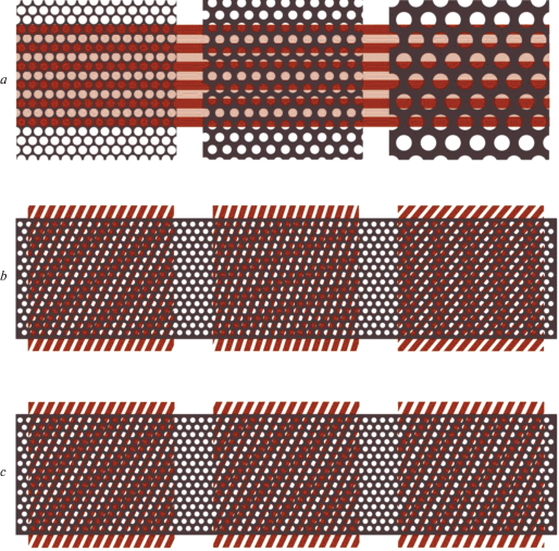
The second reason for avoiding large periodic patches is familiar to everybody from everyday experience. When a patch of relatively dense uniform periodic structure (e.g., a striped cloth or multiple parallel lines on the sheet of paper) is large enough, it evokes very unpleasant dynamic moiré images and afterimages precluding long observation. (It is interesting that even regular parallel lines of windows in large buildings often evoke unpleasant sensations (Filin, 2006) despite not producing moiré.) The moiré images emerge due to overlapping of the observed periodic pattern onto different periodic patterns of photoreceptors in the retina that perform sampling of the input images differently at different loci since the photoreceptor arrays (mosaics) are different at different eccentricities. Figure 3, b and c shows that transformations of the resulting grating images could be radical (b) and could be very “sensitive” to the spatial frequency of gratings (c). These pictures help to understand why in the case of gratings, detection acuity can be consistently better than recognition acuity: a single test grating can be reliably distinguished from a comparison uniform field irrespective of its perceptual distortions whereas recognition of the test gratings requires more perfect reproduction of their structure.
It is obvious that, for reliable VA measurements, the size of the test gratings has to be reasonably limited. Luckily, this restriction seems to be acceptable. In the experiments with presentation of gratings in windows of varying size, Roger Anderson and his colleagues showed that probability of grating detection becomes close to the final highest level when the number of grating periods in the test image exceeds six (Anderson et al., 1996).
There are also investigations showing a positive effect of introducing certain irregularity into regular photoreceptor arrays on orientation discrimination in the case of gratings (e.g. Snyder, Miller, 1977; Miller, Bernard, 1983; Evans et al., 2010). Probably, it might be one of the reasons why strictly regular retinal structures are common among lower vertebrates but absent in primates.
Thus, one could conclude that for correct use of gratings for the VA assessment and for comparison of the data obtained with the grating stimuli in different studies it is necessary to take into account all the peculiarities of the techniques and experimental paradigms that could influence the results of measurements.
Standard and modified 3-bar targets
Theoretically, sinusoidal gratings are the simplest stimuli requiring only one parameter for characterization of their shape – spatial frequency. Nevertheless, as is clear from the above consideration, in practice, an accurate interpretation of the results obtained with such simple stimuli for the VA assessment needs taking into account some other conditions of the measuring procedures. It seems natural to suppose that the stimuli of more complex shape could create more problems. Indeed, generally speaking, it is true. However, it is often not easy to predict these problems and to find the ways to solve them. In this respect, it is interesting to consider relatively simple 3-bar optotypes that are employed for visual acuity assessment, in particular, in the US army. There optotypes constitute the basis of the USAF-1951 (United States Air Force 3-bar test chart) and usually named 3-bar test targets.
The standard 3-bar test targets (S3B) consist of 3 identical black bars on a white background separated by the intervals equal to the bar width (w). The test set includes the targets with horizontal (H) and vertical (V) bar orientation. The characteristic spatial frequency Fc of each optotype corresponds to a period of grating consisting of one black bar and one white interval, i.e. Fc is equal to 60´/2w=30´/w.
It is worth noting that, before dwelling on letters as the optotypes for his famous test chart, even Snellen considered 3-bar configuration as promising for vision assessment (along with other simple images: see Colenbrander, 2008).
However, the initial version of the 3-bar targets that was taken as a basis for the USAF-1951 and became considered as a standard sample, appeared to be not quite good for practice. Leaving aside the earlier attempts to understand this situation, it is reasonable to illustrate the shortages of the standard 3-bar targets using psychometric functions and Fourier analysis. The studies of the 3-bar targets carried out at the Institute for Information Transmission Problems, RAS, during more than 10 years provided clear evidence of the principal inter-individual variability of psychometric functions, helped to understanding the reasons of this variability, and to find the ways to “improve” these optotypes making them more appropriate for practice. This work included both experimental investigations of the optotype perception in different groups of observers and theoretical analysis based on Fourier transformation (Lebedev et al., 2012; Rozhkova et al., 2012; 2017) and were crowned by computer simulation of the optotype processing in the visual system (Lebedev, 2015).
At the first stage of this work, it was unexpectedly found that, in many participants, the psychometric functions obtained with such optotypes demonstrate characteristic anomalies (Figure 4).
The left column of this figure shows “normal” cases, i.e. psychometric functions of the participants whose data corresponded to the anticipated psychometric functions gradually rising from 50% – theoretical minimum value equal to the level of guessing at random for the performed experiments with the two stimuli in the test set and 2AFC paradigm. However, such data were obtained in less than a half of the participants examined. The right column shows that, in some other participants, at threshold stimulus sizes, probability of correct responses could fall to the level of 10% and lower, i.e. probability of wrong responses reached theoretically impossible levels of 90–100% instead of 50%.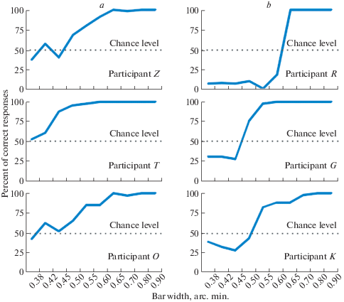
It is interesting that anomalous psychometric curves were described long ago in papers presenting the results of VA measurements in human infants by means of preferential looking methods based on Teller gratings (Held et al., 1979; Teller et al., 1982). One of the possible explanations presented in the second reference is that such psychometric functions “could be caused in one way or another by brightness difference between the grating targets and the homogeneous fields” (Teller et al., 1982, p. 1021). One source of potential brightness artifacts is that the gratings and the homogeneous field might not be exactly matched in luminance and infants may “tend to stare at the brighter of the two fields when both appear homogeneous”.
It seems likely that in participants with anomalous psychometric functions for 3-bar targets, decision about stimulus orientation could be based on some strong cue provoking the decision opposite to the correct one. Indeed, such cue could be revealed: using S3B, one could notice that, at near-threshold stimulus sizes, the orientation of the whole perceived stimulus image (i.e. long axis of the blurred spot) was orthogonal to the orientation of the just discernible separate bars. Some participants could unconsciously consider orientation of the whole image as an indication of the bar orientation when fine structure of the test stimulus became indiscernible. To counteract this misleading cue, the participants may be instructed of directing attention to the orientation of the bars only but not of the whole image. However, we haven’t find publications on the efficiency of such instruction or on any attempts to improve test images.
Since it seemed problematic to guarantee that all the examiners would give right instruction in all cases, and to control that all the observers would follow the instruction accurately, the researchers decided to correct the sizes of horizontal and vertical S3B trying to make their blurred thresholdimages equal in length and width, i.e. having no differences in sizes along horizontal and vertical directions. Indeed, varying the bar length, one could notice that the blurred images of the 3-bar optotypes with horizontal and vertical bar orientations could really be made practically indistinguishable if the bar length would be increased by15–20%.
This empirical finding was confirmed theoretically by means of Fourier analysis. It was suggested that the anomalies considered above could be explained by a specific influence on stimulus recognition of certain low-frequency components in the Fourier spectra of the standard 3-bar images (Rozhkova et al., 2012).
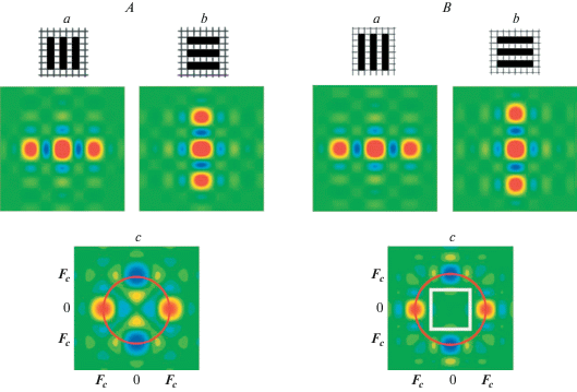
Investigating two-dimensional Fourier spectra of H- and V-S3B images (Figure 5A, a, b), the authors have found that their belongingness to H or V orientations could be ascertained not only on the basis of the high-frequency components (the large blobs around the characteristic frequency Fc) but also on the basis of low-frequency components (in particular, comparing orientations of the largest central oval blobs: their long axis are orthogonal to each other). The difference between the central blobs is more finely revealed in the amplitude difference Fourier spectrum of the two images (Figure 5A, c). This spectrum contains both pairs of Fc-blobs corresponding to the high-frequency spectral components of H-S3B and V-S3B (naturally, the second pair became negative due to subtraction) and also two pairs of the smaller and weaker blobs oriented orthogonally to the Fc-pairs as concerned their signs (colors).
Fig. 5.
A – The amplitude Fourier spectra of the standard 3-bar targets calculated for vertical (a) and horizontal (b) bar orientations and their difference amplitude Fourier spectrum (c). B – The amplitude Fourier spectra of the modified 3-bar targets calculated for vertical (a) and horizontal (b) bar orientations, and their difference amplitude Fourier spectrum (c).
The color code used: red – positive values of the spectral component amplitudes, green – zero value, blue – negative values. The marks along the horizontal and vertical directions correspond to the characteristic frequency of the optotypes, Fc. The parts of the spectra extending into the range of the spatial frequencies essentially higher than Fc are rejected since we consider in near-threshold situation, Fc is close to the highest perceivable frequency.
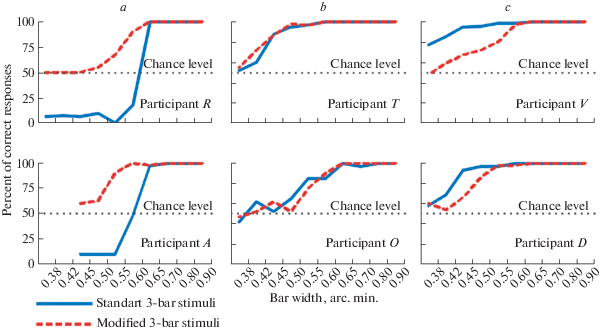
Moreover, the data of the Fourier analysis appeared to be correlated finely with the results of the experiments aimed at equalizing the blurred images of the near-threshold 3-bar targets of vertical and horizontal orientations. Creating properly modified 3-bar targets, i.e. elongating the bars by 15–20%, one could obtain the test set of modified images, H-M3B and V-M3B, that could be recognized but only on the basis of the highest spectral components around Fc. It is shown in the Figure 5B, parts a and b, containing the spectra of modified 3-bar targets, analogous to those of Figure 5A for the standard test set, H-S3B and V-S3B. It is clearly seen that moderate elongation of the bars made the spectra of H-M3B and V-M3B very similar in the low-frequency region and, accordingly, led to elimination of misleading low-frequency blobs in their difference spectrum (Figure 5B, part c). Taking into account this anticipated change, it was predicted that the modified 3-bar targets would not produce anomalous psychometric functions in the participants previously showing the probability of wrong responses of 90–100% instead of 50%. Indeed, it was confirmed: the pairs of psychometric functions obtained in these participants are shown in Figure 6, a. Also it was expected that in the observers with “normal” psychometric function for the standard 3-bar targets, stimulus modification would not change the function shape and it was really the case (Figure 6, b).
Fig. 6.
Psychometric functions obtained with the standard and modified 3-bar targets in different participants: misusing low frequency information (a), ignoring low frequency information (b), and using low frequency information properly (c).
It was natural to expect that, during examination with the standard 3-bar targets, more attentive and bright observers could notice that the two indicated orientations were orthogonal to each other and could use this fact properly in favor of increasing the probability of correct responses. In contrast to those naïve observers which systematically mess orientations of the separate bars and the whole targets unconsciously, some quick-witted participants could consciously rely on the noticed relationship of the two orientations in their responses when separate bars became indiscernible in the stimuli of near-threshold sizes. In other words, quick-witted (and also experienced or observant) participants could be able to use the described imperfectness of the standard 3-bar stimuli turning it to a prompt and guessing the bar orientation on the basis of the whole blurred image orientation (having in mind that these orientations are orthogonal to each other).
This expectation was confirmed both by interviewing such quick-witted participants and by comparing the results of their examination with the standard 3-bar stimuli and the stimuli specially modified to exclude such indirect cue of the bar orientation (Figure 6, c). It is seen, that using modified 3-bar targets instead of the standard ones led to a significant increase in the threshold values of the stimuli.
Obviously, in most cases, it takes some time to gain enough experience and notice the discussed misleading discrepancy in orientations of the bars and the whole blurred images and to learn making proper correction systematically. The number of the trials necessary for this insight varied from several tens to several hundred depending on individual abilities of participants and conditions of the stimulus presentation. For instance, it was noticed that the time of learning was much longer when the single lines of equal-sized stimuli were presented in sequence instead of traditional presentation of the whole chart with the stimuli of various sizes. It may be supposed that, in the second case, a possibility to compare perception of adjacent lines in certain intermediate range of sizes, where the bars visibility changes from quite good to problematic, helped to notice and realize the orientation discrepancy between the bars and the whole image.
It is noteworthy, that approximately 1/3 of participants showed neither positive nor negative effects of using low-frequency information in the case of H-S3B and V-S3B even if they were informed about a possibility to use it (Fig. 6, b). In the case of H-M3B and V-M3B, the psychometric functions of all participants had anticipated uniform shape corresponding to classical monotonic psychometric curve ascending from the chance level of 50% to the level of 100%-correct responses.
The curves presented in Figure 6 illustrate the following three important conclusions that could be made from the comparative studies of the standard and modified 3-bar optotypes:
– Even small changes in the optotype shape could radically affect its perception at threshold;
– If the optotype shape contains indirect cues that could essentially affect the responses, inter-individual variability of the psychometric functions could be very significant indicating existence of principal differences in visual information processing;
– Proper modification of the optotype could make individual psychometric functions more similar due to elimination of the factors causing their variability.
One could argue that, in the cases of “inappropriate” optotypes, high inter-individual variability were determined by the higher levels of visual information processing and could be eliminated by means of proper instruction. This argumentation seems to be reasonable but the situation is not so simple. Firstly, not every participant is ready to follow the more complicated instruction, and some participants will certainly use the warnings for their own profit. But there is a second, more principal complication: in some range near the threshold, most participants could unconsciously use indirect ambiguous cues and remain unaware of it.
It is reasonable to suggest that the optotypes with more complex structure conceal more ambiguous cues and, therefore, the complexity should be minimized.
Tumbling E optotypes
As was already noticed above, the standardized letters are still widely used in the VA measurements despite repeatable claims to turn attention to their serious flaws as the optotypes. Obviously, a general convenience of letters for practical applications outweighs their flaws. Nevertheless, both for theoretical analysis and for practice, it is important to understand significance of certain unfavorable features of the letters.
It seems rational to begin from the tumbling E optotypes since they differ by only one additional bar from the 3-bar optotypes analyzed above. Strictly speaking, the set of the E-shaped stimuli in four orientations can not be considered as a test with letter optotypes (it was specially created for the illiterate people): in fact, only one of these stimuli corresponds to certain “normal” letter. However, from theoretical point of view, this is not essential since geometrical features and perceptional characteristics of the tumbling-E stimuli are comparable to the typical stimuli categorized as letters and to the standardized letter stimuli used in optometry.
The difference spectra calculated for the tumbling-E stimuli and the psychometric functions obtained with these stimuli are presented in Figures 7 and 8 along with corresponding data for the standard 3-bar optotypes.
Fig. 7.
The difference power Fourier spectra of the tumbling E optotypes calculated for the pairs with parallel and orthogonal main bar orientations (a and b) and of the standard 3-bar targets with vertical and horizontal bar orientations (c).
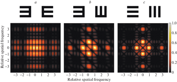
Fig. 8.
Psychometric functions obtained with the tumbling E stimuli and the standard 3-bar targets in different participants which (according to the previous data) misused low frequency information (a), ignored low frequency information (b), and used low frequency properly (c).
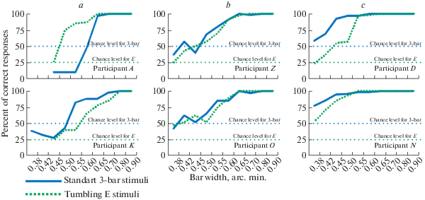
In Figure 7 (unlike Figure 6), shows the power difference spectra, not the amplitude ones. It was done to provide a possibility of direct comparison between the data of our lab studies studies and similar earlier data published by Anderson and Thibos (1999a). Their paper contains additional important data related to perception of filtered optotypes with reduced spectra created by cutting the lower or higher frequencies. The psychometric functions obtained with such optotypes help to identify those frequency components which might be sufficient for discrimination of the stimuli in the test set. However, these authors performed their study with only two observers and, therefore, had little possibility to reveal that the observer’s psychometric functions could differ principally. This was found in the experiments performed at our lab (Figure 8) supporting our anticipation that different subjects could differently use low-frequency information and demonstrating different types of psychometric functions for tumbing E even in the cases of similar psychometric functions for the standard 3-bar stimuli (Figure 8a).
Sloan letters
At present, the preferred letter stimuli in clinical practice is Sloan letters (Sloan, 1959) comprising the basis of the ETDRS charts (Ferris et a., 1982; 1993). However, a majority of clinicians do not realize how far the examination with such letters from the ideal procedure of the VA assessment. To illustrate this, it is enough to consider a sample of psychometric functions published in the paper (Plainis et al., 2007). The purpose of the authors was to evaluate a modified ETDRS chart with a set of Sloan letters different from the standard commercial ETDRS sets. Planning to create a chart for European-wide use, the authors decided to include there but only the Sloan letters readable by all European citizens. Comparison of the two charts was performed by measuring VA in a large number of schoolchildren, on one hand, and by assessing the psychometric functions of 5 subjects, obtained for 18 Sloan letters, on the other hand.
As an example, we selected three curves from all the psychometric functions presented in the paper and combined them on one graph (Figure 9).
Fig. 9.
Psychometric functions of the letters (K, S, Z) from one and the same line of the ETDRS chart.
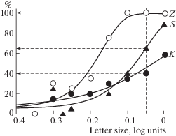
These curves were obtained for the letters Z, S and K (using seven letter sizes with a progression of 0.05 log units) in one and the same subject. It is clearly seen that the curves are essentially different revealing different legibility of these letters. The dashed lines help to see that, at the level of –0.05 log units, probability of correct response is equal to 100% for the letter Z, about 65% – for S, and only 40% – for K. Since the levels shown along the horizonet al axis (0.0; –0.1; –0.2; and so on) correspond to the lines of the ETDRS charts, it is evident that each line could contain the letters of very different legibility thus reducing the accuracy of the VA measurements. It seems irresponsible to declare high accuracy of the VA measurements with the charts including such optotypes.
A significant decrease of accuracy due to different legibility of letters is a general flaw of most existing letter charts. The requirement of equal legibility of all the test stimuli is the obligatory requirement of the precise tests for the VA assessment. Regarding letters, the conclusion from all the data available in the literature is that one could find no more than 5–6 Sloan letters of similar legibility (see Figure 5 from Plainis et al., 2007 as an example) that could be employed to construct a chart of standard structure for precise VA measurements.
It was already mentioned above that there were attempts to complete the set of letters for each line not on the basis of the letter sizes but on the basis of legibility thus putting the letters of different heights in one and the same line. Though such an approach seems to be problematic in application to the charts, probably, it can be easier introduced into practice of computer measurements with sequential presentation of single test stimuli.
DESIGNS OF THE CHARTS FOR VISUAL ACUITY ASSESSMENT
Though since the time of publishing the first chart for the VA assessment by Küchler in 1843, a lot of various devices were proposed as the testing tools, especially during the last fifty years, the charts continue to hold a primary position among all the tools up to date. They are widely spread over the world and have a lot of versions. Being filled with different optotypes, they appeared to be appropriate for many purposes, conditions, and populations. Their total amount is not assessed, probably it numbers several hundreds.
History of the visual chart development
The chronological sequence of various visual chart emerged over the time is presented in Figure 10. Because of technical limitations, not all the worthy charts are included, however, this Figure 10 helps to view the main stages in of the visual chart development.

Ripening and integration of general main ideas about reasonable visual chart structure took approximately 30 years. The three basic principal steps are shown in Figure 11, a. The process was initiated by Küchler who invented regular placing of the test material (the set of printed words) in parallel lines according the letter size (Küchler, 1843: the chart 1 in Figure 11, a). The second inventor was Snellen who introduced the notion of optotypes and appreciated the necessity of standardization. He designed special letter images (simplified Latin letters with serifs on 5×5 matrix), calibrated them and employed in the first standardized chart for visual acuity assessment (Snellen, 1862: the chart 2 in Figure 11, a). The chart included 11 horizontal lines (rows) of calibrated letters decreasing in size from the top edge. The arrangement of the letters over the chart was nearly uniform but the numbers of letters in the rows varied significantly – from 1 (the first row with the largest letter) to 9 (the row with the smallest letters). In the Snellen chart, standardization was only partial, however, the chart layout, or format, elaborated by Snellen, determined the basic variables for upgrading this tool later: proportions of the test letters, progression of the letter sizes (reference levels), number of rows, numbers of letters in each row, horizontal letter spacing, vertical spaces between the rows.

The next principal idea of the reasonable chart design was proposed by Green (1868). This researcher simplified the letter shape further (eliminated serifs) and invented a chart design now known as proportional or logarithmic (the chart 3 in the Figure 11, a). In the Green chart, the sizes of the standardized letters were decreasing from the top to the bottom in geometrical progression; the spacing of letters in each row and vertical distances between different rows were proportional to the letter size; and the number of letters in all the rows (barring the first one with the largest letters) was one and the same. It is remarkable that such a design is very similar to the design of modern standard ETDRS chart: the only difference is the number of letters per row (in the ETDRS charts, it is equal to 5). However, the invention of Green was not introduced into practice when he was alive and even much later. Perhaps, one of the reasons was too large number of letters per line in the proposed charts that could make examination too long. The ideas of Green firstly emerged in practice in 1976 when Bailey and Lovie proposed similar chart design with only five letters in each row (Bailey, Lovie, 1976; Bailey, Lovie-Kitchin, 2013).
In 1888, Landolt published a new chart with the optotypes principally different in shape from the letters – the rings inscribed into 5×5 matrix with a gap of 1 element (later named “Landolt Cs”). However, the design of the Landolt C charts based on these optotypes was similar to the Snellen charts but not to the Green chart. The influence of both Landolt’s and Green’s ideas could be revealed in the work of Kholina (1930) who created a set of charts with nearly proportional design and the steps in size of 0.05 log units – twice smaller than 0.1 log units proposed by Green and (after more than 100 years ) used in the Bailey-Lovie chart.
Later evolution of the charts for the VA assessment could be characterized mainly by including new content and/or varying its layout to make the chart more appropriate for particular purposes or population contingents. In the second half of the XX century, a lot of charts emerged for examination of children; naturally, most ot them contained various pictures as the optotypes.
Figure 11, b shows the examples of the charts with various arrangement of content proposed by the researchers for various purposes: vision screening in Russia (2), investigation of crowding effect (3), assessment of peripheral vision (10), comparison of the examination with the two different optotypes (9); etc.
In optometry, a serious effort was made to provide total standardization of the VA charts while accuracy and efficiency of the VA measurements attracted lesser attention. There were many publications repeating the guidelines for the chart design that are actually were not proved to be necessary in all conditions by means of proper experimental investigations. This remark concerns such recommendations as:
– to use logarithmic design exclusively;
– the horizontal spacing between the optotypes should be equal to the width of the optotypes on a line;
– the vertical spacing between the lines should be the height of the optotypes in the next line down;
– the size of the optotypes should progress geometrically up or down the chart by approximately 0.1 log units; etc.
Though it was reasonable to follow universal strict recommendations during the earlier studies, at present, is seems more important to stimulate a search for other possibilities: the attained better knowledge of visual processing, vision mechanisms, and their impairment shows that, in view of optimizing vision examination and visual diagnostics, the recommendation should depend on many factors and conditions.
Let us consider one of the chart parameters – the number (N) of the optotypes per row. Figure 12 clearly demonstrates that the reasonable values of N strongly depend on the set of the optotypes. The following three cases are analyzed: 2; 4 and 10 optotypes of equal legibility in the sets (corresponding to the chance levels 0.5; 0.25; and 0.1 for correct recognizing single optotypes). The evaluation of the procedures is based on calculation of the probability (p) to give correct responses at random to all N optotypes in the row. As is shown in the Figure 12, a, such a probability is rapidly decreases with increasing N, and probability of erroneous measurements decreases correspondingly. If we use the criterion p<0.05, the proper numbers N will be inside the green area, namely: 2; 3; and 5 for the sets of 10; 4; and 2 optotypes, correspondingly. The values of N for other probabilities of the erroneous measurements are shown in Figure 12, b. One could conclude that for the sets of four Landolt Cs or tumbling E (chance level 0.25), the values of p equal to 0.001; 0.0039; and 0,0155 will be obtained in the cases of N=5; N=4; and N=3, respectively. It is the task of the researcher to find a reasonable compromise between the accuracy and the duration of measurements.
Fig. 12.
Probability of erroneous VA measurement due to successful guessing at random.
a – Probability of correct responses to all the optotypes in the rows containing different numbers (1–6) of optotypes from the sets with 2; 4; and 10 optotypes of equal legibility (chance levels for single optotypes are 0.5; 0.25; and 0.1, respectively) in the case of guessing at random.
b – The numbers of the optotypes in the rows needed for reducing successful guessing at random (erroneous VA measurement) to 0.1%; 0.39%; 1.55%; and 6.25% of the population examined in the cases of the chance levels 0.1; 0.25; and 0.5 for single optotypes.
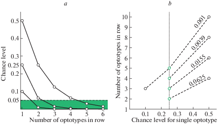
It is impossible to scope all the aspects of the appropriate VA measurements for various purposes and in various conditions. However, it seems obligatory to dwell briefly on examination of patients with mental retardation and special needs. Since such patients are often characterized by significant limitations both in perceptual skills and intellectual functioning, it is very important to optimize the examination procedures and tools in order to avoid failure and waste of time. That is why the information about usability of each test is being collected and analyzed systematically to help the clinicians. An example of such an analysis taken from (Caywood, Nett, 2005) is presented in the Table 2. This Table contains a fragment of the larger Table from the indicated publication with ratings of various vision tests. We have only selected information related to several well known VA tests and concerning general integral ratings. Each test was subjectively ranked as to its appropriateness for a variety of handicaps including speech, sensory, and cognitive developmental impairments. The ranking criteria for the tests were: (1) not useful; (2) adequate, but may be difficult to perform or provide gross measurements; (3) may be appropriate, but other tests may provide more standardized results; (4) useful, provides standardized results and can be performed with relative ease. The data presented in the Table 2 evidence that the scores could significantly depend on the type of impairment and could be both increasing and decreasing with age. Such information seems to be indispensable for regular examination of patients.
Table 2.
Procedure ratings* for several VA tests by the specialists working with a variety of handicaps
| Subjects | ||||||
|---|---|---|---|---|---|---|
| Tests | Hearing impairment Developmental age of 2 yrs |
Motor impairment Developmental age of 2 yrs |
Mute patient Developmental age of 2 yrs |
Hearing impairment Developmental age of 6 yrs |
Motor impairment Developmental age of 6 yrs |
Mute patient Developmental age of 6 yrs |
| Snellen | 1 | 1 | 1 | 4 | 4 | 4 |
| HOTV | 1 | 1 | 1 | 4 | 4 | 4 |
| Lea symbols | 4 | 4 | 4 | 3 | 3 | 3 |
| Broken wheel | 1 | 1 | 1 | 4 | 4 | 4 |
| Teller acuity cards | 4 | 4 | 4 | 2 | 2 | 2 |
| Cardiff cards | 4 | 4 | 4 | 2 | 2 | 2 |
* Ranking criteria for the tests: 1. Not useful. 2. The test is adequate, but may be difficult to perform or provide gross measurements. 3. The test may be appropriate, but other tests may provide more standardized results. 4. The test is useful, provides standardized results and can be performed with relative ease.
Concluding remarks
A general conclusion from this review is that establishing universal “golden standards” for the test images and for design of the VA charts is unrealistic and unnecessary. On the contrary, at present, it seems promising to spend more efforts on elaboration of specific optotypes and charts for various purposes.
Of course, it is very important to have some standard tools for regular population studies. However, with time, the standards become obsolete; and now existing international standards on visual testing procedures, optotypes, instruments, trueness and precision of measurements (ISO 8596; 8597; 5725-2) seem to be validated not so good in view of our contemporary knowledge of visual processing in the human visual system.
Moreover, standard methods of investigations can not reveal the early stages of visual impairments. In order to improve the whole system of vision care it is necessary to have a large variety of the VA measuring tools intended for vision monitoring and treatment.
In each case of the VA assessment, the optimal solution depends on the purpose of investigation, the characteristics of the individuals to be examined, and the conditions of measurements. The examiners have to understand the advantages and disadvantages of the chosen tests and take them into account both in planning the procedure and in interpretation of the results obtained.
Список литературы
Allen H.F. A new picture series for preschool vision testing. American Journal of Ophthalmology. 1957. V. 44. P. 38–41.https://doi.org/10.1016/0002-9394(57)91953-0
Anderson R.S. Improving ophthalmic diagnosis in the clinic using the Moorfields Acuity Chart. Expert Review of Ophthalmology. 2017. V. 12 (6). P. 433–435. https://doi.org/10.1080/17469899.2017.1395696
Anderson R.S., Thibos L.N. Relationship between acuity for gratings and for tumbling-E letters in peripheral vision. Journal of the Optical Society of America A. 1999a. V. 16 (10). P. 2321–2333. https://doi.org/10.1364/josaa.16.002321
Anderson R.S., Thibos L.N. Sampling limits and critical bandwidth for letter discrimination in peripheral vision. Journal of the Optical Society of America A. 1999b. V. 16 (10). P. 2334–2342. https://doi.org/10.1364/josaa.16.002334
Anderson R.S., Evans D.W., Thibos L.N. Effect of window size on detection acuity and resolution acuity for sinusoidal gratings in central and peripheral vision. Journal of the Optical Society of America A. 1996. V. 13 (4). P. 697–706. https://doi.org/10.1364/josaa.13.000697
Atkinson J. The developing visual brain. N.Y.: Oxford Univ. Press. 2000. 211 p.
Bailey I.L., Lovie J.E. New design principles for visual acuity letter charts. American Journal of Optometry and Physiological Optics. 1976. V. 53 (11). P. 740–745. https://doi.org/10.1097/00006324-197611000-00006
Bailey I.L., Lovie-Kitchin J.E. Visual acuity testing. From the laboratory to the clinic. Vision Research. 2013. V. 90. P. 2–9. https://doi.org/10.1016/j.visres.2013.05.004
Bondarko V.M., Danilova M.V. What spatial frequency do we use to detect the orientation of a Landolt C? Vision Research. 1997. V. 37 (15). P. 2153–2156.https://doi.org/10.1016/S0042-6989(97)00024-2
Campbell F.W., Green D.G. Optical and retinal factors affecting visual resolution. The Journal of Physiology. 1965. V. 181. P. 576–593. https://doi.org/10.1113/jphysiol.1965.sp007784
Campbell F.W., Robson J.G. Application of Fourier analysis to the visibility of gratings. The Journal of Physiology. 1968. V. 197. P. 551–566. https://doi.org/10.1113/jphysiol.1968.sp008574
Caywood J., Nett J. Optometric assessment of the patient with mental retardation or special needs. College of Optometry. 2005. 1503. https://commons.pacificu.edu/opt/1503
Colenbrander A. Consilium Ophthalmologicum Universale Visual Functions Committee. Visual acuity measurement standard. Italian Journal of Ophthalmology. 1988. V. 2 (1). P. 1–15.
Colenbrander A. The historical evolution of visual acuity measurement. Visual Impairment Research. 2008. V. 10 (2–3). P. 57–66. https://doi.org/10.1080/1388235080263240
Curcio C.A., Sloan K.R., Kalina R.E., Hendrickson A.E. Human photoreceptor topography. The Journal of Comparative Neurology. 1990. V. 523 (292). P. 497–523. https://doi.org/10.1002/cne.902920402
Dennett W.S. Test type. Transactions of the American Ophthalmological Society. 1886. V. 4. P. 133–139.
Donders F.C. On the anomalies of accommodation and refraction. New Sydenham Society, London. 1864.
Doria C. À la recherche de la vision “normale” mesurer l’acuité visuelle au XIXe siècle. Canadian Bulletin of Medical History. 2020. V. 37 (1). P. 147–172. (in French)https://doi.org/10.3138/cbmh.312-012019
Doria C. Searching for the normal vision. Measuring visual acuity in the 19th century. Medicina Historica. 2021. V. 5 (2). P. e2021015. Available from: https://mattioli1885journals.com/index.php/MedHistor/article/view/90
Evans D.W., Wang Y., Haggerty K.M., & Thibos L.N. Effect of sampling array irregularity and window size on the discrimination of sampled gratings. Vision Research. 2010. V. 50 (1). P. 20–30. https://doi.org/10.1016/j.visres.2009.10.001
Fantz R.L., Ordy J.M., Udelf M.S. Maturation of pattern vision in infants during the first six months. Journal of Comparative and Physiological Psychology. 1962. V. 55. P. 907–917. https://doi.org/10.1037/h0044173
Fariza E., Kronheim J., Medina A., Katsumi O. Testing visual acuity of children using vanishing optotypes. Japanese journal of ophthalmology. 1990. V. 34 (3). P. 314–319.
Ferris F.L. III, Kassoff A., Bresnick G.H., Bailey I. New visual acuity charts for clinical research. American journal of ophthalmology. 1982. V. 94 (1). P. 91–96.https://doi.org/10.1016/0002-9394(82)90197-0
Ferris F.L. III, Freidlin V., Kassoff A., Green S.B., Milton R.C. Relative letter and position difficulty on visual acuity charts from the Early Treatment Diabetic Retinopathy Study. American Journal of Ophthalmology. 1993. V. 116 (6). P. 735–740. https://doi.org/10.1016/S0002-9394(14)73474-9
Filin V.A. Videoehkologiya [Videoecology]. Moscow, Videoehkologiya. 2006. 512 p. (in Russian)
Frisén L. Vanishing optotypes. New type of acuity test letters. Archives of Ophthalmology. 1986. V. 104 (8). P. 1194−1198. https://doi.org/10.1001/archopht.1986.01050200100060
Gräf M., Becker R. Determining visual acuity with LH symbols and Landolt rings. Klinische Monatsblatter fur Augenheilkunde. 2008. V. 215 (2). P. 86–90. https://doi.org/10.1055/s-2008-1034677
Green J. On a new series of test-letters for determining the acuteness of vision. Transactions of the American Ophthalmological Society. 1868. V. 1 (4–5). P. 68–71.
Hamm L.M., Anstice N.S., Black J.M., Dakin S.C. Recognition acuity in children measured using the Auckland Optotypes. Ophthalmic and Physiological Optics. 2018a. V. 38 (6). P. 596–608. https://doi.org/10.1111/opo.12590
Hamm L.M., Yeoman J.P., Anstice N.S., Dakin S.C. The Auckland Optotypes: an open-access pictogram set for measuring recognition acuity. Journal of Vision. 2018b. V. 18. P. 1–15. https://doi.org/10.1167/18.3.13
Hamm L.M., Langridge F., Black J.M., Anstice N.S., Vuki M., Fakakovikaetau T., Grant C.C., Dakin S.C. Evaluation of vision screening of 5–15-year-old children in three Tongan schools: comparison of The Auckland Optotypes and Lea symbols. Clinical and Experimental Optometry. 2019. V. 103 (3). P. 353–360. https://doi.org/10.1111/cxo.12958
Held R., Gwiazda J., Brill S., Mohindra I., Wolfe J. Infant visual acuity is underestimated because near threshold gratings are not preferentially fixated. Vision Research. 1979. V. 19 (12). P. 1377–1379. https://doi.org/10.1016/0042-6989(79)90210-4
Heinrich S.P., Bach M. Resolution acuity versus recognition acuity with Landolt-style optotypes. Graefe’s Archive for Clinical and Experimental Ophthalmology. 2013. V. 251 (9). P. 2235–41. https://doi.org/10.1007/s00417-013-2404-6
Hyvärinen L., Näsänen R., Laurinen P. New visual acuity test for pre-school children. Acta Ophthalmologica. 1980. V. 58 (4). P. 507–511. https://doi.org/10.1111/j.1755-3768.1980.tb08291.x
ISO 8596. International Standard. Ophthalmic optics. Visual acuity testing. Standard optotype and its presentation. Geneve: International Standards Organization, 1994. (2nd edition: 2009).
ISO 8597. International Standard. Optics and optical instruments. Visual acuity testing. Method of correlating optotypes. Geneve: International Standards Organization, 1994.
ISO 5725-2. International Standard. Accuracy (trueness and precision) of measurement methods and results. Basic methods for the determination of repeatability and reproducibility of a standard measurement method. International Standards Organization, Geneva, 1994.
Jaeger E. Ueber die Pruefung des Sehvermoegens bei Gesunden wie Kranken in Ueber Staar und Staaroperationen. 1854. Wien.
Kay H. New method of assessing visual acuity with pictures. British Journal of Ophthalmology. 1983. V. 67. P. 131–133. https://doi.org/10.1136/bjo.67.2.131
Kazakova A., Gracheva M., Rozhkova G., Pokrovskiy D.F., Medvedev I.B. Novel visual acuity charts with modified 3-bar optotypes: approbation in cataract patients. Proc. of The 12th conference of the Lithuanian Neuroscience Association. 2020. P. 36.
Kholina A. Novaya tablitsa dlya issledovaniya ostroty zreniya [A new chart for visual acuity assessment]. Russkii oftal’mologicheskii zhurnal. 1930. V. 11 (1). P. 42–47. (in Russian).
Kniestedt C., Stamper R. L. Visual acuity and its measurement. Ophthalmology Clinics of North America. 2003. V. 16 (2). P. 155–170. https://doi.org/10.1016/s0896-1549(03)00013-0
Koskin S.A., Boiko É.V., Sobolev A.F. Shelepin Yu.E. Mechanisms of recognition of the outlines of “vanishing” optotypes. Neuroscience and Behavioral Physiology. 2007. V. 37. P. 59–65. https://doi.org/10.1007/s11055-007-0150-0
Koskin S.A. Sistema opredeleniya ostroty zreniya v tselyakh vrachebnoi ekspertizy [The systems of visual acuity measurements for medical examination]. MD diss, 2009. St Petersburg. (in Russian).
Landolt E. Méthode optométrique simple. Bulletins et Memoires de la Société Français d’Ophtalmologie. 1888. V. 6. P. 213–214.
Lebedev D.S., Belozerov A.E., Rozhkova G.I. Optotipy dlya tochnoi otsenki ostroty zreniya [Optotypes for an accurate assessment of visual acuity]. Patent RF. No. 2447826. 2012.
Lebedev D.S. Model mekhanizma raspoznavaniya orientatsii 3-polosnykh dvukhgradatsionnykh optotipov [A model of orientation recognition mechanisms for the 3-bar two-grade optotypes]. Sensornye sistemy [Sensory systems]. 2015. V. 29 (4). P. 309–320.
Lippmann O. Vision of young children. Archives of Ophthalmology. 1969. V. 81. P. 763– 775.
Lippmann O. Vision screening of young children. American journal of Public Health. 1971. V. 61. P. 1586–1601.
Linksz A., John Green, the AOS, and the reasonable notation of visual acuity measurements. Transactions of the American Ophthalmological Society. 1972. V. 70. P. 314–327.
Marg E., Freeman D.N. Visual acuity and sensitive period. Proceedings of the Fourth Symposium on Sensory Physiology. Leningrad, Academy of Sciences USSR IP Pavlov Institute of Physiology. 1976. P. 124–132.
Mayer D.L., Beiser A.S., Warner A.F., Pratt E.M., Kaye K.N., Lang J.M. Monocular acuity norms for the Teller acuity cards between ages one month and four years. Investigative Ophthalmology & Visual Science. 1995. V. 36 (3). P. 671–685.
Mayer D.L., Dobson V. Assessment of vision in young children: A new operant approach yields estimates of acuity. Investigative Ophthalmology & Visual Science. 1980. V. 19. P. 566–570.
Mayer D.L., Dobson V. Visual acuity development in infants and young children, as assessed by operant preferential looking. Vision Research. 1982. V. 22. P. 1141–1151.https://doi.org/10.1016/0042-6989(82)90079-7
Miller W.H., Bernard G.D. Averaging over the foveal receptor aperture curtails aliasing. Vision research. 1983. V. 23 (12). P. 1365–1369. https://doi.org/10.1016/0042-6989(83)90147-5
Moiseenko G.A., Pronin S.V., Zhil’chuk D.I., Koskin S.A., Shelepin Yu.E. Vanishing optotypes and objective measurement of human visual acuity. Journal of Optical Technology. 2020. V. 87 (12). P. 761–766. https://doi.org/10.1364/JOT.87.000761
Monoyer F. Echelle typographique d’ecimale pour mesurer l’acuit’e visuelle. Gaz. Med. Paris. 1875. V. 21. P. 258.
Norcia A.M., Tyler C.W. Spatial frequency sweep VEP: visual acuity during the first year of life. Vision Research. 1985. V. 25 (10). P. 1399–1408.
Plainis S., Tzatzala P., Orphanos Y., Tsilimbaris M.K. A modified ETDRS visual acuity chart for European-wide use. Optometry and Vision Science. 2007. V. 84 (7). P. 647–653.
Pugmire G.E., Sheridan M.D. Test types for very young or mentally backward children. Med Officer. 1930. V. 43. P. 133–134.
Pugmire G.E., Sheridan M.D. Revised vision screening chart for very young or retarded children. Med Officer. 1957. V. 98. P. 53–55.
Richman J.E., Petito G.T., Cron M.T. Brocken wheel acuity test: A new and valid test for preschool and exceptional children. Journal of the American Optometric Association. 1984. V. 55. P. 561–565.
Rozhkova G.I., Belozerov A.E., Lebedev D.S. Izmerenie ostroty zreniya: neodnoznachnost' vliyaniya nizkochastotnykh sostavlyayushchikh spektra Fur’e optotipov [Visual acuity measurement: uncertain effect of the low-frequency components of the optotype Fourier-spectra]. Sensornye sistemy [Sensory systems]. 2012. V. 26 (2). V. 160–171. (in Russian).
Rozhkova G.I., Gracheva M., Lebedev D.S. Optimizatsiya testovyh znakov i tablits dlya izmereniya ostroty zreniya [Optimisation of the test symbols and charts for visual acuity measurements]. Nevskiye gorizonty. 2014. P. 563–567.
Rozhkova G.I., Lebedev D., Gracheva M., Rychkova S. Optimal optotype structure for monitoring visual acuity. Proceedings of the Latvian Academy of Sciences. Section B. 2017. V. 71 (5). P. 20–30. https://doi.org/10.1515/prolas-2017-0057
Rozhkova G.I., Gracheva M.A. Paramei G.V. An overview of the visual acuity assessment. 1.Primary measures and various notations. Sensornye sistemy [Sensory systems]. 2021. V. 35(3). P. 179–198. https://doi.org/10.318/SO235009221030033
Shah N., Dakin S.C., Anderson R. Effect of optical defocus on detection and recognition of vanishing optotype letters in the fovea and periphery. Investigative Ophthalmology & Visual Science. 1996. V. 53 (11). P. 7063–7070. https://doi.org/10.1167/iovs.12-9864
Shah N., Dakin S.C., Redmond T., Anderson R.S. Vanishing Optotype acuity: repeatability and effect of the number of alternatives. Ophthalmic and Physiological Optics. 2011. V. 31 (1). P. 17–22. https://doi.org/10.1111/j.1475-1313.2010.00806.x
Shah N., Laidlaw D.A.H., Brown G., Robson C. Effect of letter separation on computerised visual acuity measurements: Comparison with the gold standard Early Treatment Diabetic Retinopathy Study (ETDRS) chart. Ophthalmic and Physiological Optics. 2010. V. 30 (2). P. 200–203. https://doi.org/10.1111/j.1475-1313.2009.00700.x
Shah N., Dakin S.C., Dobinson S., Tufail A., Egan C.A., Anderson R.S. Visual acuity loss in patients with age-related macular degeneration measured using a novel high-pass letter chart. British Journal of Ophthalmology. 2016. V. 100 (10). P. 1346–1352. https://doi.org/10.1136/bjophthalmol-2015-307375
Shamshinova A.M., Volkov V.V. Funktsional’nye metody issledovaniya v oftal’mologii [Functional methods of diagnostics in ophthalmology]. Moscow, Meditsina. 1999. 416 p.
Sheridan M.D. Vision screening of very young or handicapped children. British medical journal. 1960. V. 2 (5196), 453–456. https://dx.doi.org/10.1136%2Fbmj.2.5196.453
Sloan L.L. New test charts for the measurement of visual acuity at far and near distances. American Journal of Ophthalmology. 1959. V. 48 (6). P. 807–813. 10.1016/0002-9394(59)90626-9
Snellen H. Test-types for the determination of the acuteness of vision. Utrecht: P. W. van de Weijer. 1862.
Snyder A.W., Miller W.H. Photoreceptor diameter and spacing for highest resolving power. Journal of the Optical Society of America. 1977. V. 67 (5). P. 696–698. https://doi.org/10.1364/JOSA.67.000696
Stiers P., Vanderkelen R., Vandenbussche E. Optotype and grating visual acuity in preschool children. Investigative Ophthalmology & Visual Science. 2003. V. 44 (9). P. 4123–4130. https://doi.org/10.1167/iovs.02-0739
Stiers P., Vanderkelen R., Vandenbussche E. Optotype and grating visual acuity in patients with ocular and cerebral visual impairment. Investigative ophthalmology & visual science. 2004. V. 45 (12). P. 4333–4339. https://doi.org/10.1167/iovs.03-0822
Taylor H.R. Applying new design principles to the construction of an illiterate E chart. 1978. American Journal of Optometry and Physiological Optics. 55: 348–351. https://doi.org/10.1097/00006324-197805000-00008
Teller D.The forced-choice preferential looking procedure: A psychophysical technique for use with human infants. Infant Behavior and Development. 1979. V. 2. P. 135–153. https://doi.org/10.1016/S0163-6383(79)80016-8
Teller D. Measurement of visual acuity in human and monkey infants: The interface between laboratory and clinic. Behavioural Brain Research. 1983. V. 10. P. 15–23. https://doi.org/10.1016/0166-4328(83)90146-8
Teller D. First glances: The vision of infants. Investigative Opgthalmology and Visual Science. 1997. V. 38. P. 2183–2203.
Teller D., Mayer D.L., Makous W.L., Allen J.L. Do preferential looking techniques underestimate infant visual acuity? Vision Research. 1982. V. 22 (8). P. 1017–1024. https://doi.org/10.1016/0042-6989(82)90038-4
USAF-1951. United States Air Force 3-bar resolution test chart.
Watson A.B., Ahumada A.J. Predicting visual acuity from wavefront aberrations. Journal of Vision. 2008. V. 8 (4). P. 1–19. https://doi.org/10.1167/8.4.17
Watson A.B., Ahumada A.J. Modeling acuity for optotypes varying in complexity. Journal of Vision. 2012. V. 12 (10). P. 1–19. https://doi.org/10.1167/12.10.19
Wen Y., Chen Z., Zuo C., Yang Y., Xu J., Kong Y, Cheng H., Yu M. Low-contrast high-pass visual acuity might help to detect glaucoma damage: a structure-function analysis. Frontiers in Medicine. 2021. V. 8. 680823. https://doi.org/10.3389/fmed.2021.680823
Westheimer G. Chapter 7: Visual acuity and spatial modulation thresholds. Handbook of sensory physiology. 1972. P. 170–187.
Wollman K. A brief history of optotype. 2020. URL: https://mattjensenmarketing.com/brief-history-optotype/ (accessed 23.06.2021).
Дополнительные материалы отсутствуют.
Инструменты
Сенсорные системы